
Form
As an important interface to obtain user input, forms play the important role of matching answers to questions.
When designing a form, it's recommended to:
Make sure users know what is required to enter and why.
Use sample language as
labelfor ordinary users and professional terms for experts. If sensitive information (for example ID card number, mobile phone number) is required, explain why.Provide rich context to help users complete the form.
Using "proper default value", "structured format", "tooltip" and "reminder" are practical for describing such context.
Be error-sensitive and fault-tolerant.
Be error-sensitive means giving feedback to users quickly through a variety of validation rules of user input. If the validation starts only after a form is submitted, it would be too late. Being fault-tolerant means it should be allowed to use different kinds of formats as well as syntax. For example, if a user types in some spaces into a phone number input box, the system should delete those spaces automatically instead of telling the user to correct them.
Don't ask unnecessary questions.
Content#
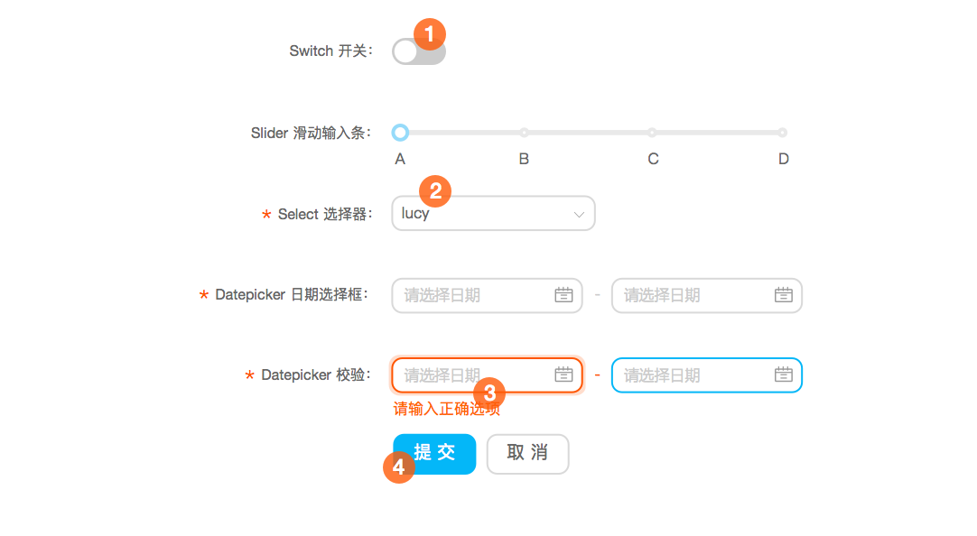
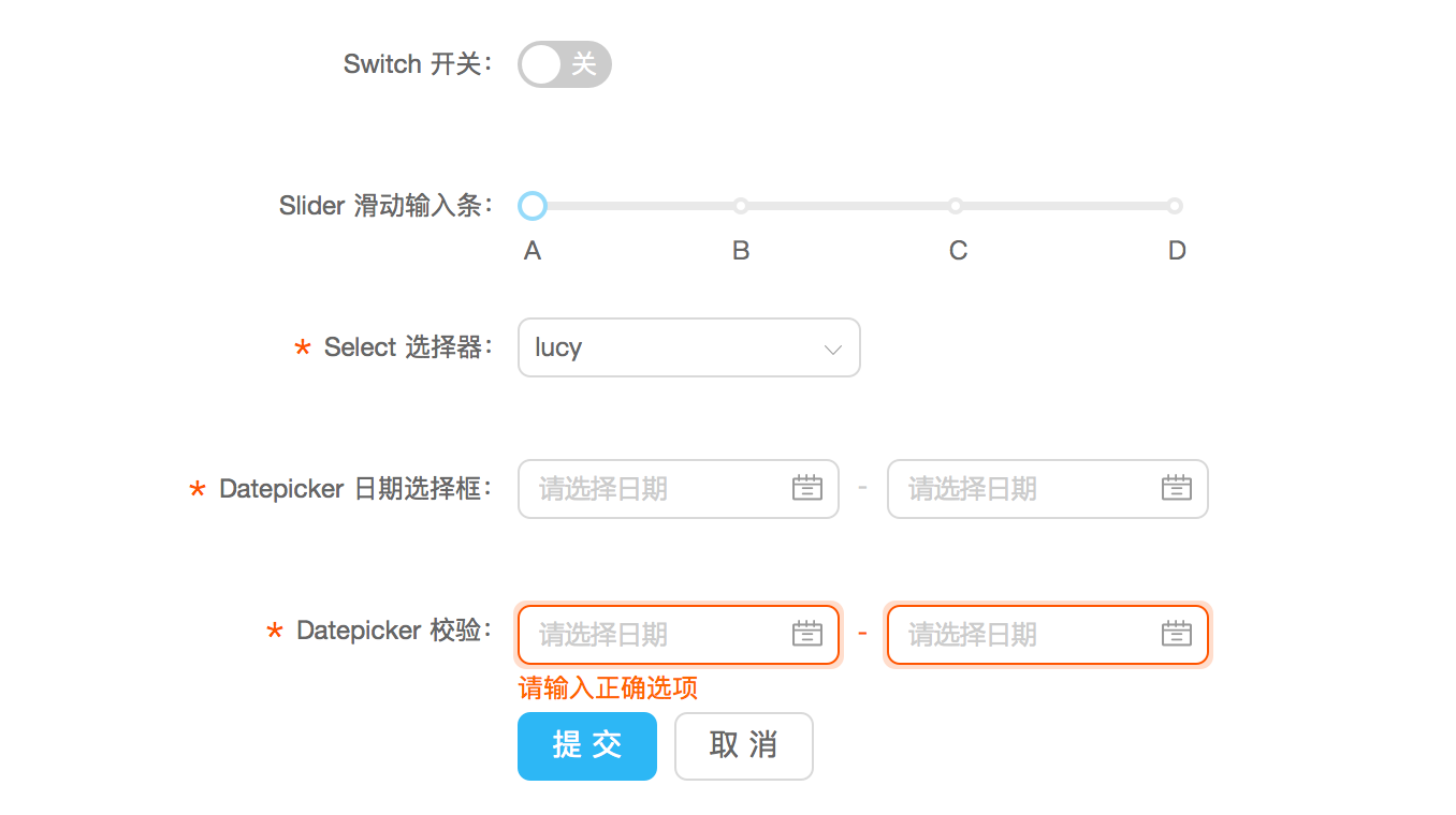
A form usually consists of 4 parts:
Label
Input box
Validation feedback
Action
Note:
*indicates that the input is required.
Interactions#
Gap filling input#

Gap filling input usually appears in a descriptive context to help users understand the current situation and provide information correctly.
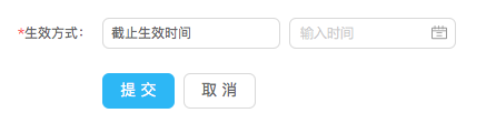
Combined input#

When two input boxes have strong correlation, they can be combined together so as to save some space.
Alignment#
When designing a form, button groups should be aligned to the left of the input boxes.
Disabled main button#
When there are just a few (less than 3) input boxes in a form, "submit" button or other main buttons should be disabled if a user has not yet filled in all required input boxes. However, when there are too many input boxes (more than 5), do not disable those main buttons.
When there are just a few input boxes, users can see feedback once they type in something and thus the rule is easy to understand.
When there are many input boxes (especially when required input boxes are altogether with optional ones), the logic of feedback can be very complicated. Thus, disabling main buttons may cause confusion.
Structured format#

The structured format can be used if users are familiar with the input content and the system doesn't accept any deviation from the desired format.
Tooltip & reminder#


Use a tooltip if a brief input label may cause confusion while you still want to keep the label text to be short.
Use a reminder if you want users to pay attention to the format or purpose of an input box. A reminder will disappear once there is something typed in the input box, so it should be used only when users are familiar with the content.
Password input box#
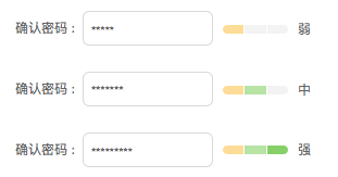
Password input box provides real time feedback on password strength and validity. It's quite applicable to a registration page.
Validation#

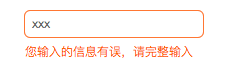
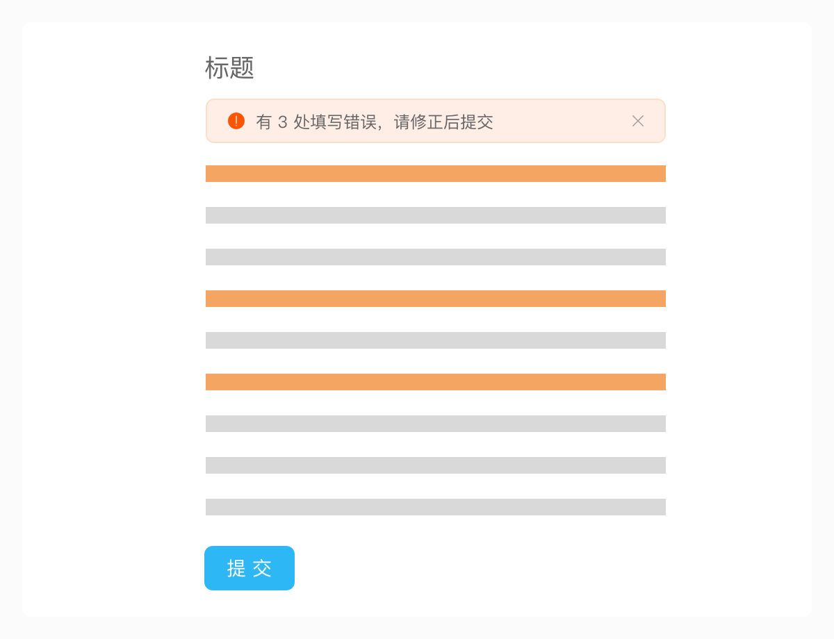
Use different validation rules and a variety of feedback to help users correct errors before they click on a "submit" button.
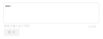
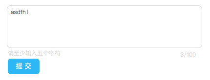
Character counting box#

A character counting box can show the current number of characters and checks if this number exceeds the limit.
Format#
Margin#
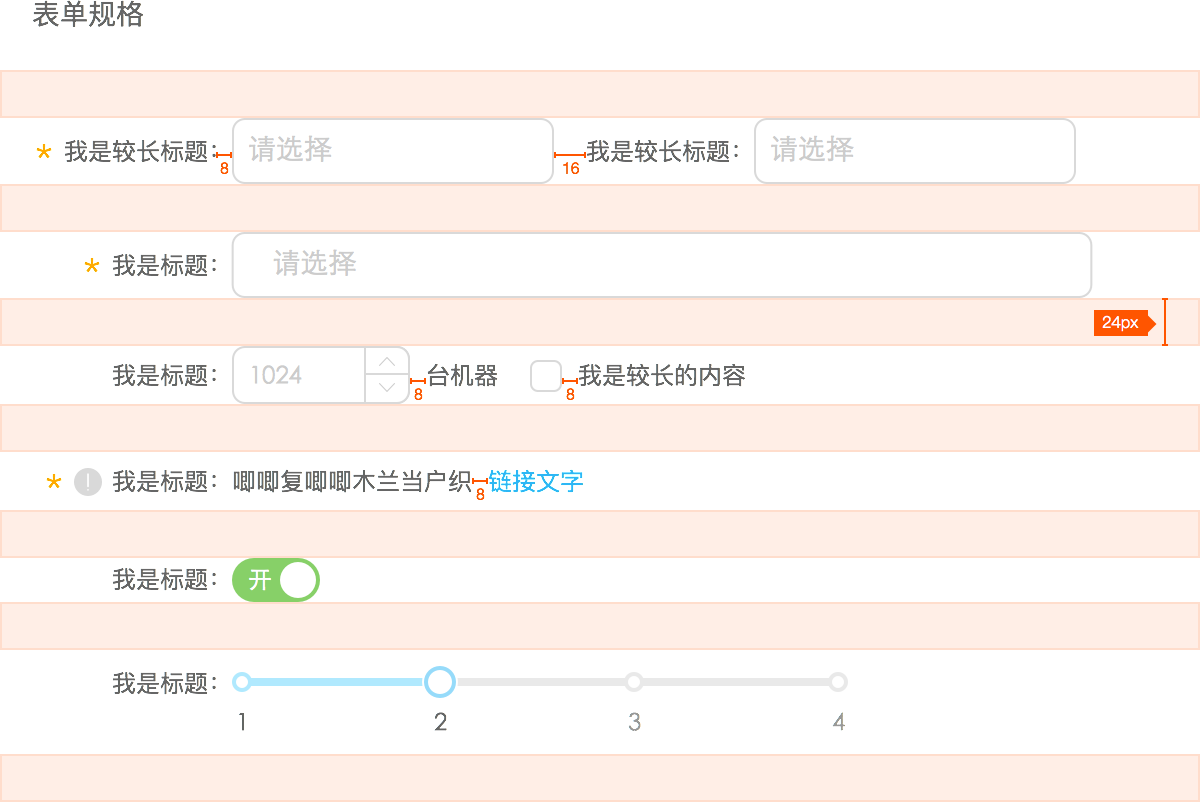
A typical example of using margin between inputs.
Width#
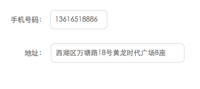
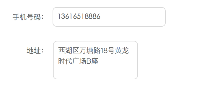
If the maximum length of an input content is known, it's recommended to define the input width according to the maximum length.
Alignment#
There are both advantages and disadvantages for any particular alignment. Thus, you need to be clear about your purposes (if you want to speed up or slow down a user) and the limitations (screen width restrictions, problems of localization, etc.) before choosing one of those alignments.
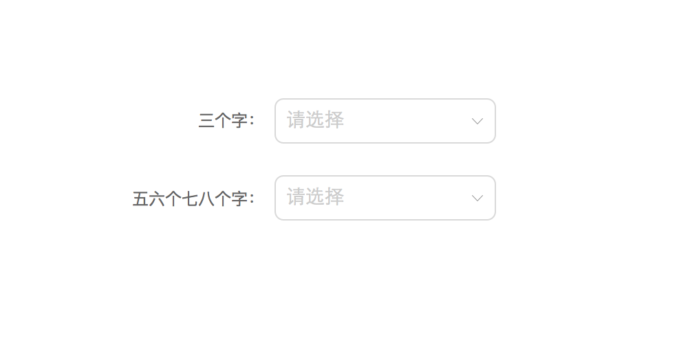
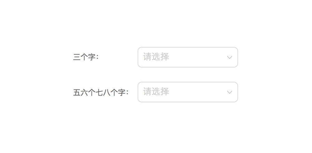
Right alignment (recommended)
Advantage: saves vertical space.
Disadvantages: reduces readability; reduces flexibility of the input length
When to use: you want to save more vertical space and speed up users for filling a form.
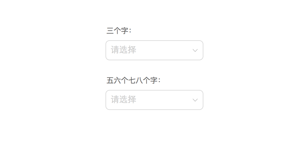
Top alignment
Advantages: high readability; high flexibility of the label length.
Disadvantages: takes a lot of vertical space.
When to use: you want users to finish filling the form quickly.
Left alignment
Advantages: easy to read and saves vertical space.
Disadvantages: slows down users and reduces flexibility for the input length.
When to use: you want to slow down users so that they can take more considerations when filling a form.