
Navigation
Broadly speaking, anything telling users where they are, where to go and how to get there can be called navigation. We abstract common navigation patterns and provide handy components to help designers and developers build a clear and smooth navigational system. When using navigation or customizing navigational structures, please pay attention to following common pitfalls:
Provide visual and contextual cues as much as possible, to prevent users from getting lost
Maintain consistency between form and behavior, or reduce the number of items in navigation, to decrease user's learning cost
Minimize page transitions (i.e. reduce the number of page transitions required by a task from several to just once or twice), to ensure that the user travels only a short distance from one page to another
Commonly Used Navigation Patterns#
| Side Navigation | Top Navigation | |
|---|---|---|
| Pros | Hierarchy is easily extensible; Makes room for page content horizontally; Allows fixed position, so that user can navigate to intended page quickly. | Conforms to common human habit of browsing top-down, easy to browse and click; Content area usually stays in a fixed width (i.e. 1208px), so page layout is more stable and less sensitive to screen sizes. |
| Cons | Sensitive to screen sizes because content area usually resides in a Grid. | At present, most monitors are widescreen, so top navigation occupies a large area of valuable vertical space while waste a lot of horizontal space; Number and title length of menu items are limited. |
| Summary | Suitable for multi-level, operation intensive and dashboard-like web apps. | Suitable for landing pages and consumer facing web apps. |
We categorize common navigation patterns into side and top navigations. Either has its own pros and cons, and should be chosen accordingly.
Examples for reference Commonly Used Layout。
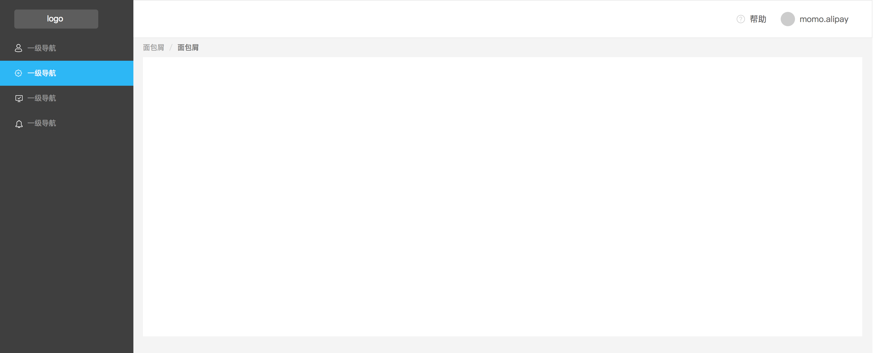
Side Navigation#
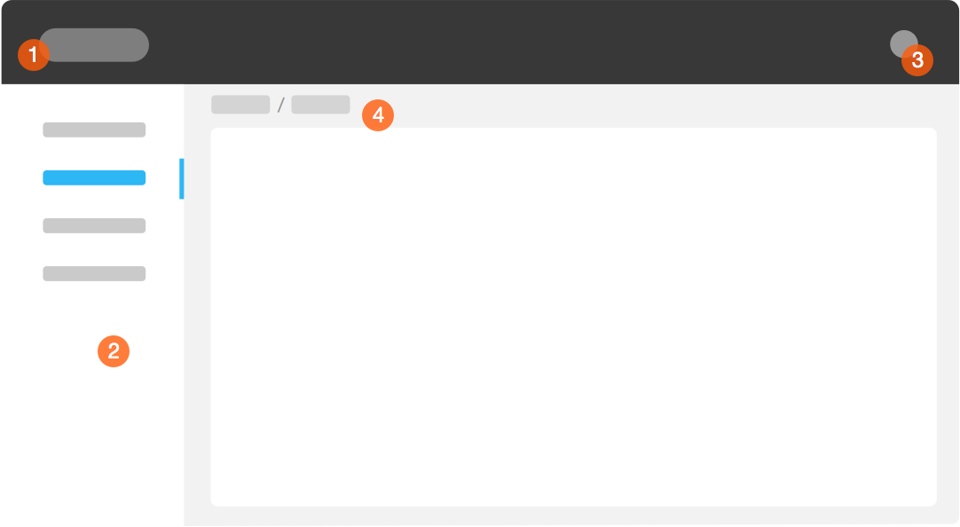
Navigational structure consists of following parts:
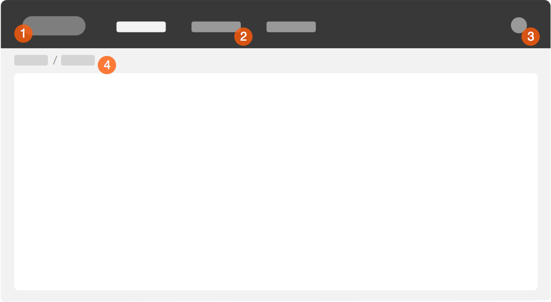
Product Logo and Name
Menu Items
Login
Breadcrumb (optional)
About Breadcrumb#
Avoid using breadcrumbs as much as you can, especially when a page contains other navigation components sufficiently telling where users are.
Breadcrumb can be categorized as:
Path-Centric: dynamically showing a path of how user reaches current page
Position-Centric: usually fixed, showing position of current page among entire site structure
Property-Centric: showing categorical property of current page
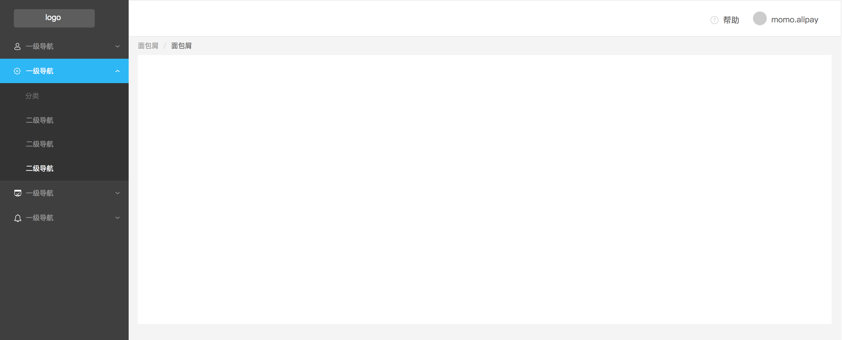
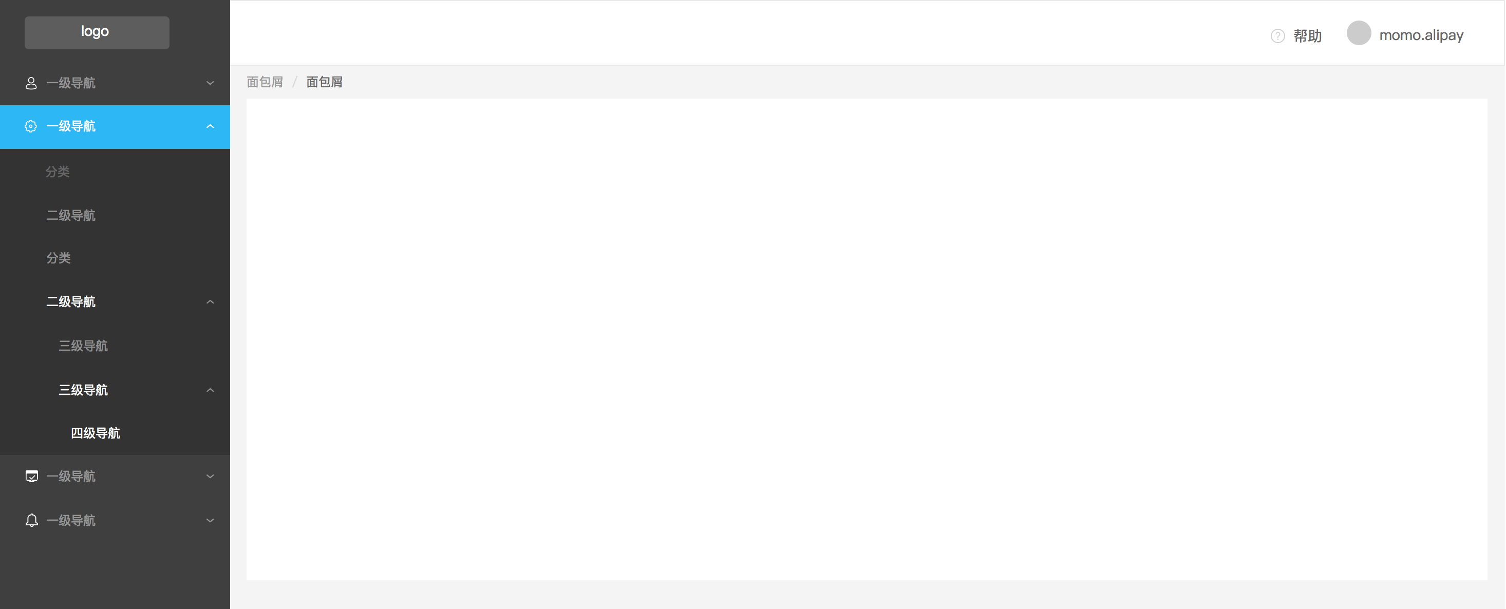
Here we provide navigation patterns for different kinds of menu hierarchy.
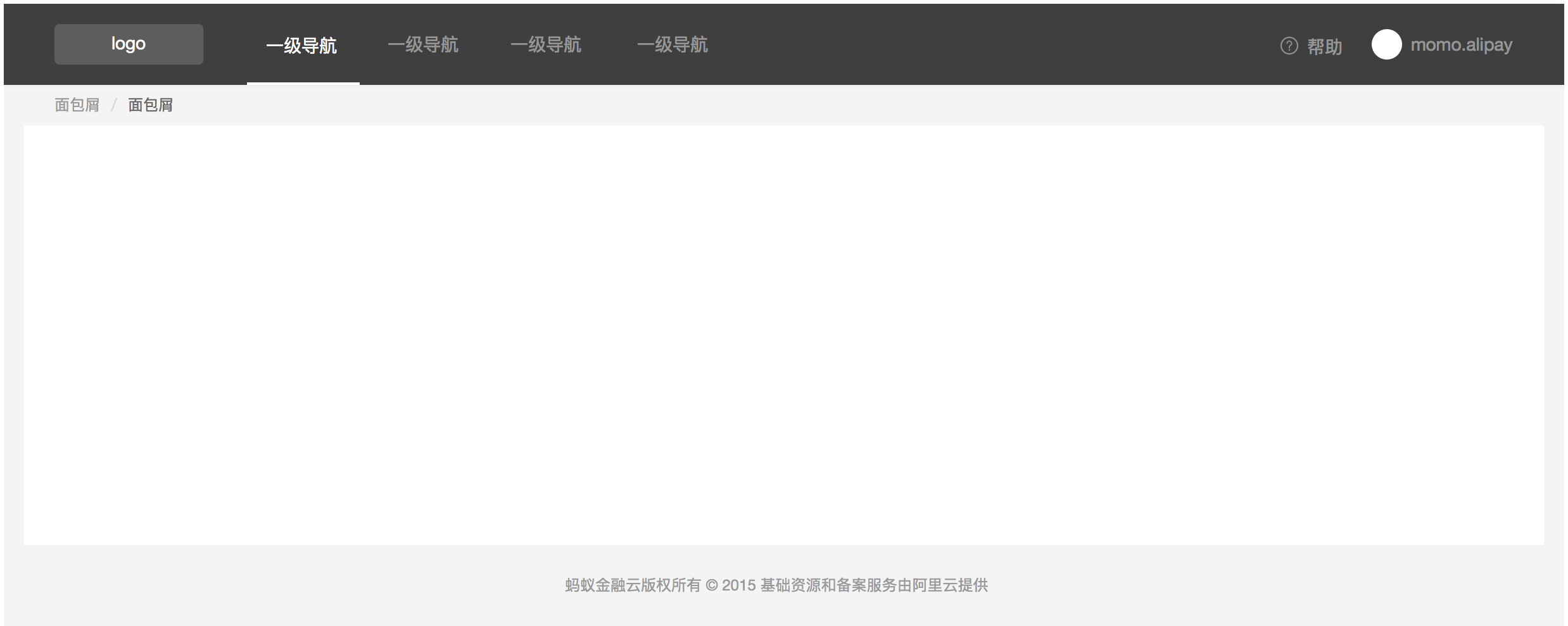
Top Navigation#
Navigational structure consists of following parts:
Product Logo and Name
Menu Items
Login
Breadcrumb (optional)
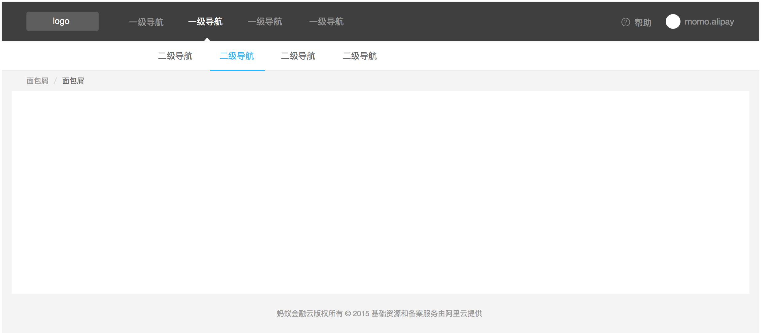
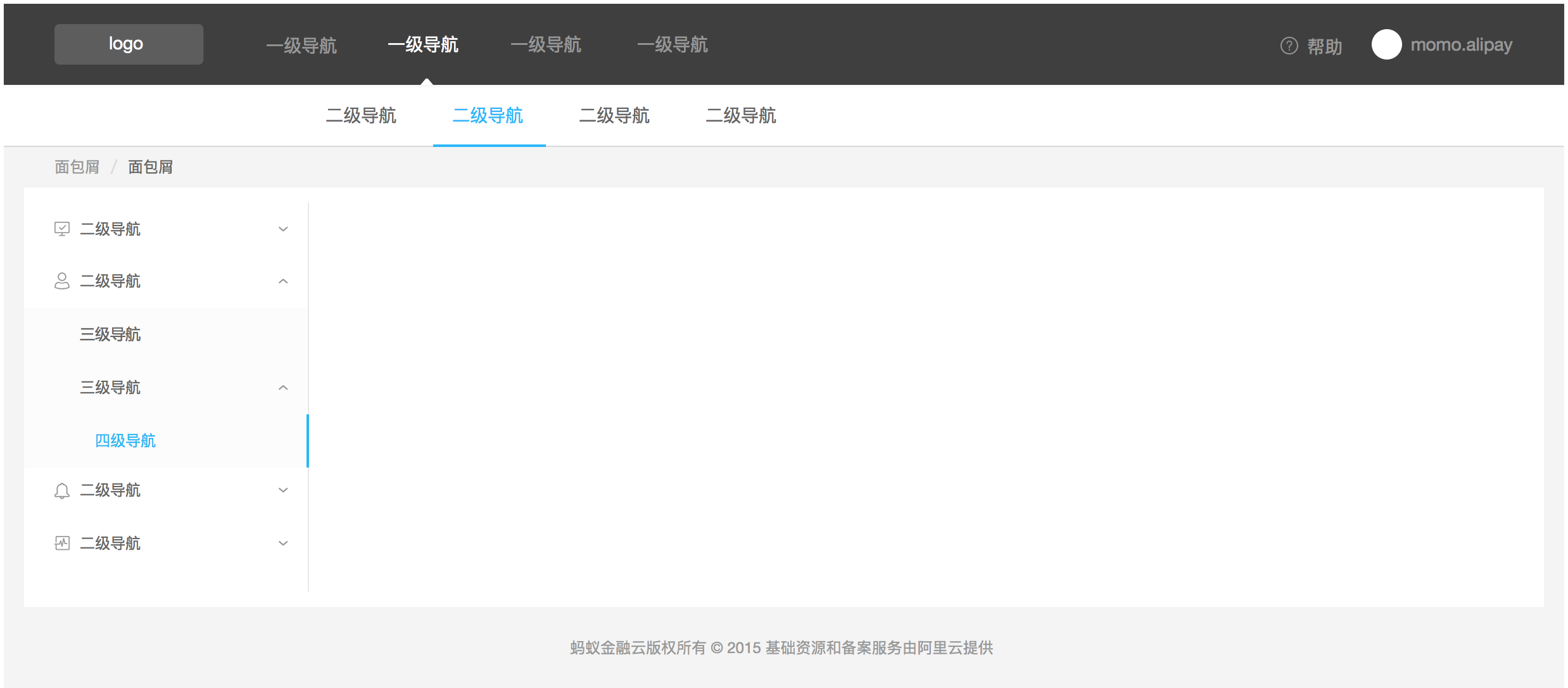
Multi-level Menu Items.