
Layout
Layout is the prerequisite for a webpage. It's also the foundation of follow-up interactive and visual design. In order to guarantee consistency among similar products, Ant Design provides some common layout templates. Before choosing one of these templates, you need to have a clear mind about:
The main tasks that a user needs to accomplish and all necessary information for making such decisions.
The priorities and features of those tasks and information, so as to select a reasonable layout
Commonly used layout#
Through a large number of practices, Ant Design summarized six commonly used layout templates. There are home page, dashboard, list page, table page, details page and form page. Knowing these templates helps to find out a suitable layout for your product quickly.
Home page#
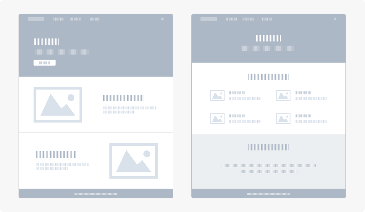
Home page is usually the first step for a user to understand a website or the products. Generally, home page consists of product drawings, brief product introductions, and user login interfaces. In the design, we recommend you to:
Keep the copywriting clear and simply, which helps you better express the ideas.
Use intuitive pictures for a product, which helps to deepen a user's understanding and impression.
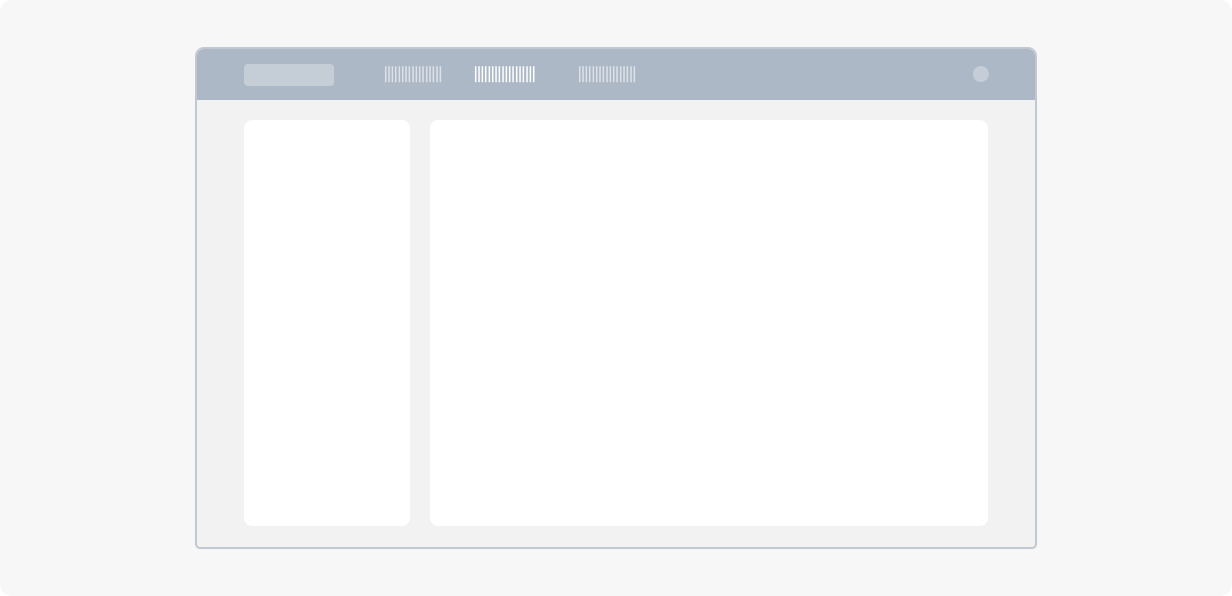
Dashboard#
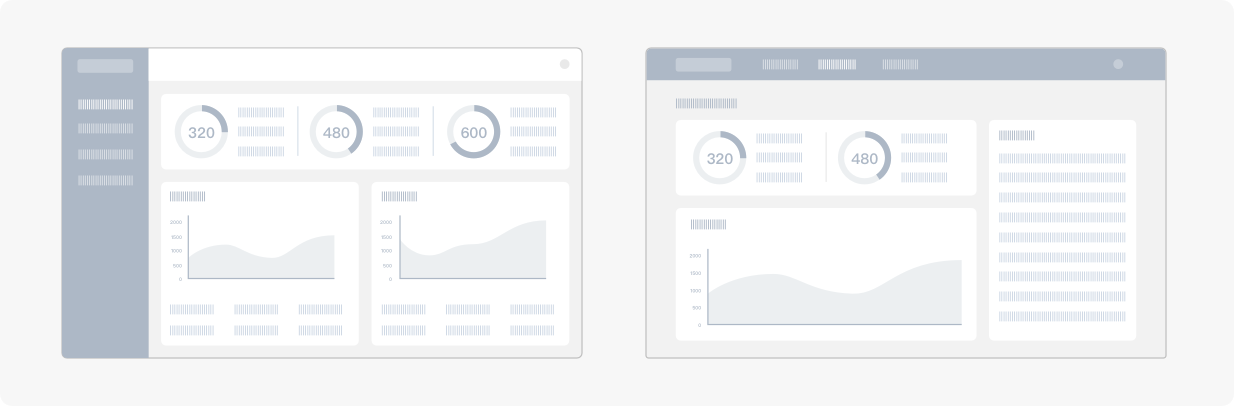
Dashboard collects a variety of information, such as digitals, graphics, copywriting, etc. Key information should be clearly represented and easily understood. Thus, displaying the complex information in a clear way is important in the design. For this propose, we recommend you to:
Organize the page layout according to the importance of information, so as to highlight key points.
Visualize the data, which allows users to understand key information as well as the overall situation in an intuitive way.
Use color and grid layout logically, which helps to reduce a user's visual fatigue.
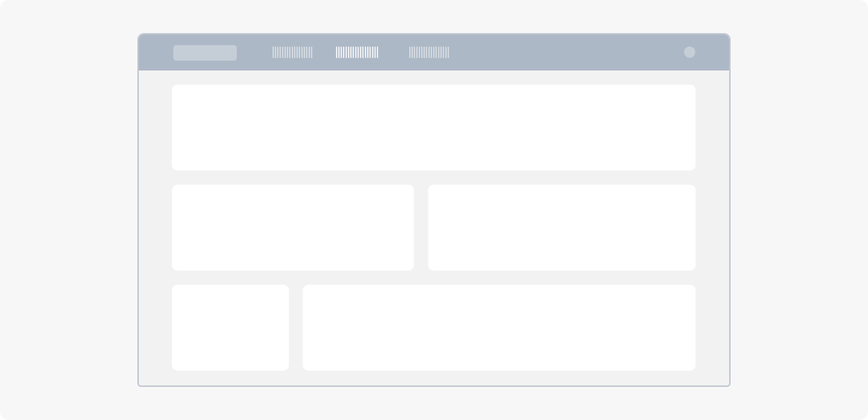
List page#
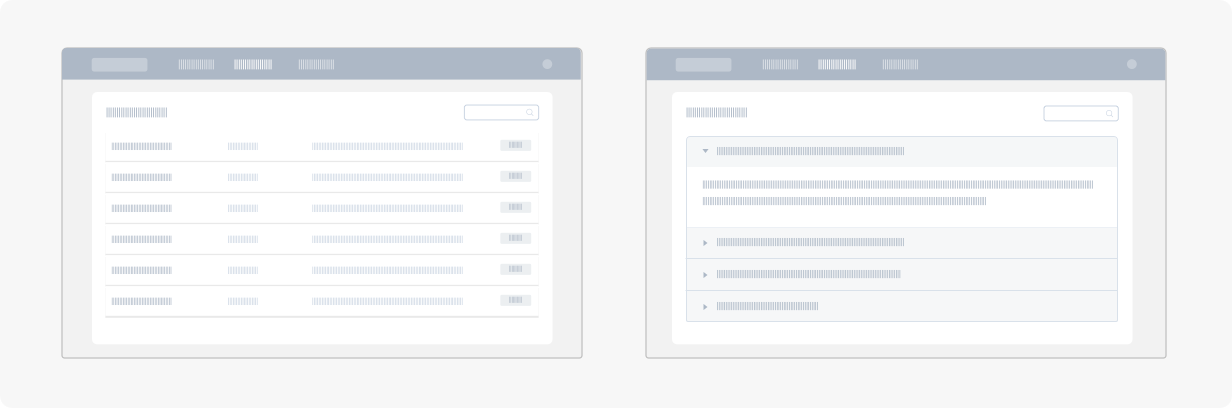
List is a way to display information in parallel. A well designed list can be helpful for users to read basic information and perform corresponding operations quickly. Therefore, the "readability" and "operability" of a list are the keys to the design. For this propose, we recommend you to:
Identify the importance of information accordingly and show nothing but key information as well as the corresponding operations.
Fold secondary information or put it into the details page. It allows a user to access information in a progressive way when the content is too complex.
Table page#
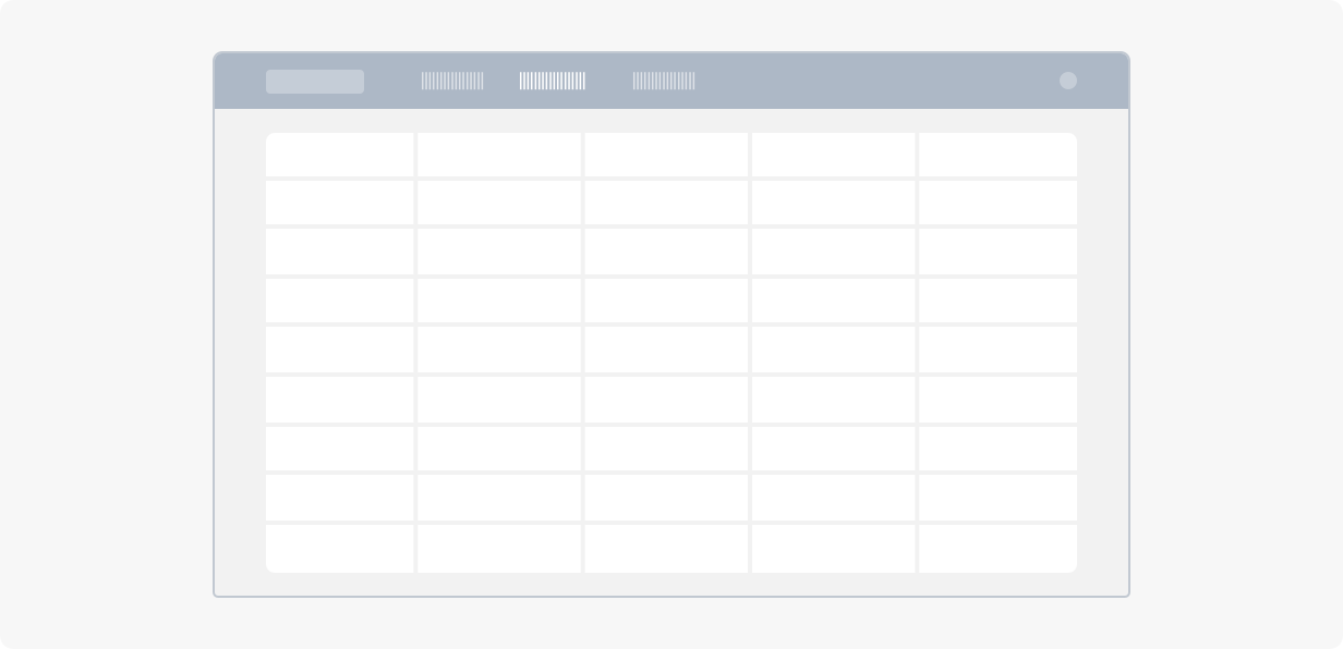
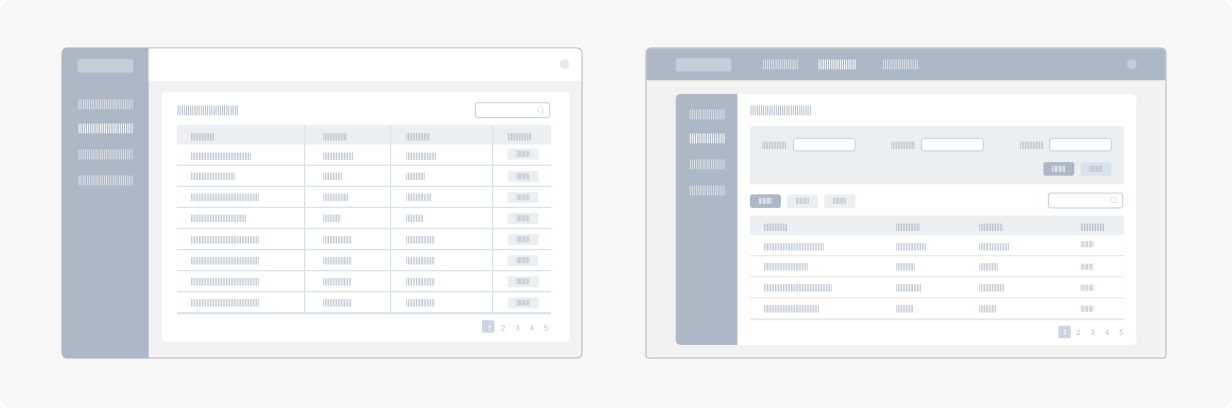
Table is a carrier for multi-dimensional information. It can make complex information to be read and understood easily. Its readability, convenience and operability play an essential role in the user experience. Therefore, we should pay attention to the following points in the design:
Construct a clear table layout. It can be helpful for a user to receive and understand information.
Highlight key information through some visual adjustments.
Use the horizontal or vertical zebra strip smartly when there is a large multi-row table or there are multiple columns in each row. By doing so, information is more distinguishable and easier to be understood.
Details page#
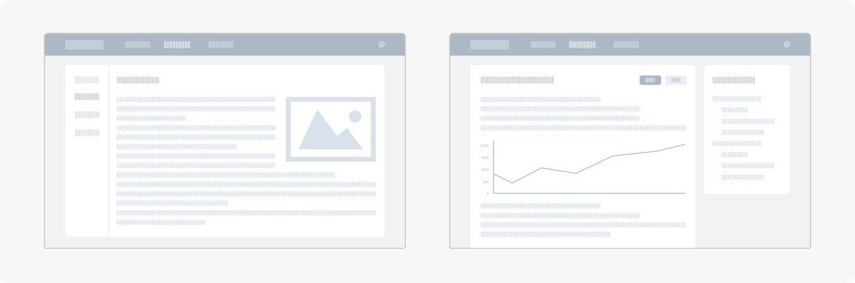
Details page usually carries a large amount of basic information, extended information as well as status information. It's important to identify priorities of the information. A clear layout can be helpful for a user to get key information at a glance and make decisions efficiently. In the design, it's worth noting that:
Layout format, text size and text spacing, are the key factors that affect a user's efficiency to access information.
Text with graphic can be better understood than pure text.
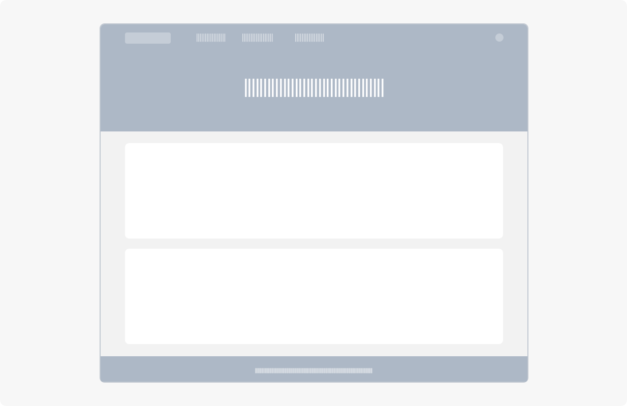
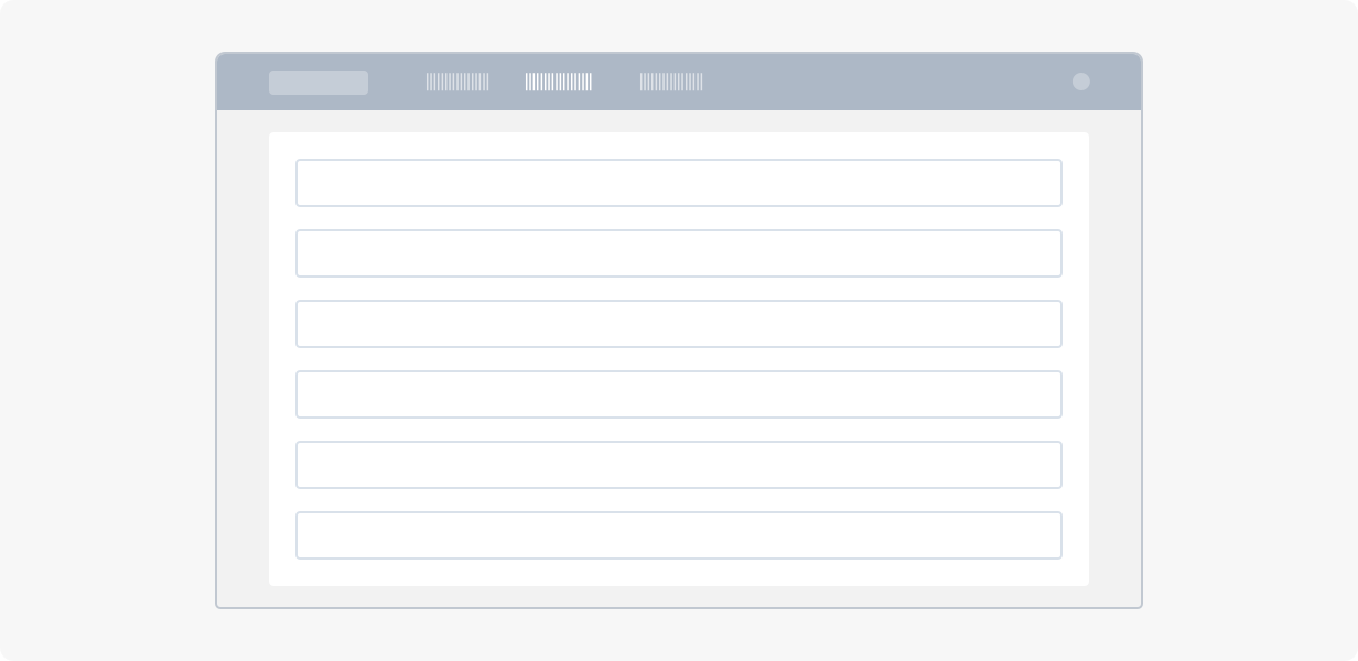
Form page#
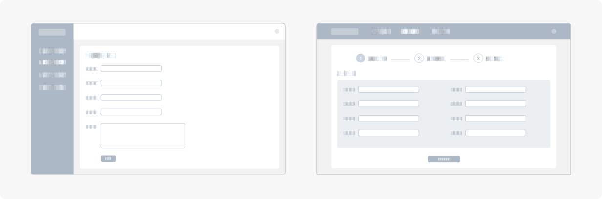
Form page is often used for tasks such as login, register, booking, comment, etc. Form page is indispensable when you need to record the user information. Therefore, a well designed form page can guide the user to complete the data recording workflow behind the form efficiently. We recommended you to:
Provide a clear user's view path, in consideration of how a user will browse the information;
Simplify the content of a form (try to avoid redundant inputs)
Name the tags that can be easy to read and understand. Avoid confusions caused by ambiguous descriptions;
Place eye-catching submit buttons on the end of a user's view path, which makes it more conducive for a user to complete all the operations.
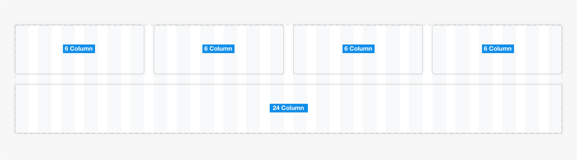
Grid#
There are Grid and Gutter in AntD layout. During the design, you can make an assumption that the "total page width is 1440px, and the "content area width is 1208px". Based on this assumption, you can design the page in 24 evenly divided columns.
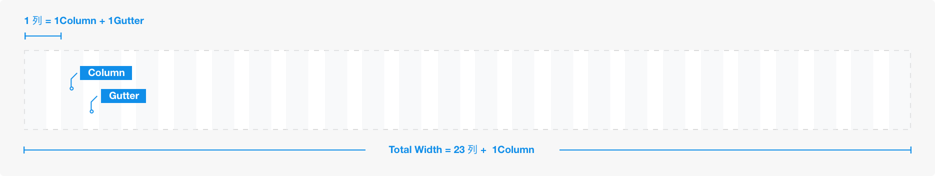
It is recommended that the number of blocks arranged in the horizontal direction be at most four, at least one, so as to guarantee the comfort of view.
Note: The gray parts are called "Column", and the white parts are called "Gutter".
Grid formula#
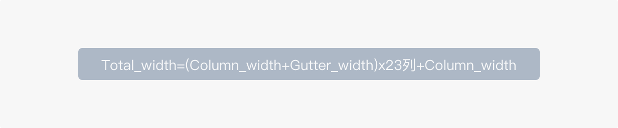
The Gutter value in ant design is fixed. When the width of a browser decrease or increase within a certain range, the width of grids will be changed accordingly, but the width of Gutter remains unchanged.
There are two Gutters in Ant Design
24px width
Gutter, which is used in home page and Dashboard16px width
Gutter, which is used in list Page, table page, details page and form page.