Keep it Lightweight
Fitts’s Law is an ergonomic principle that ties the size of a target and its contextual proximity to ease of use.In other words, if a tool is close at hand and large enough to target, then we can improve the user’s interaction. Putting tools in context makes for lightweight interaction.
Fitts's Law : The time to acquire a target is a function of the distance to and size of the target. It is proportional to the distance to the target and inversely proportional to the width of the target.
Always-Visible Tools#
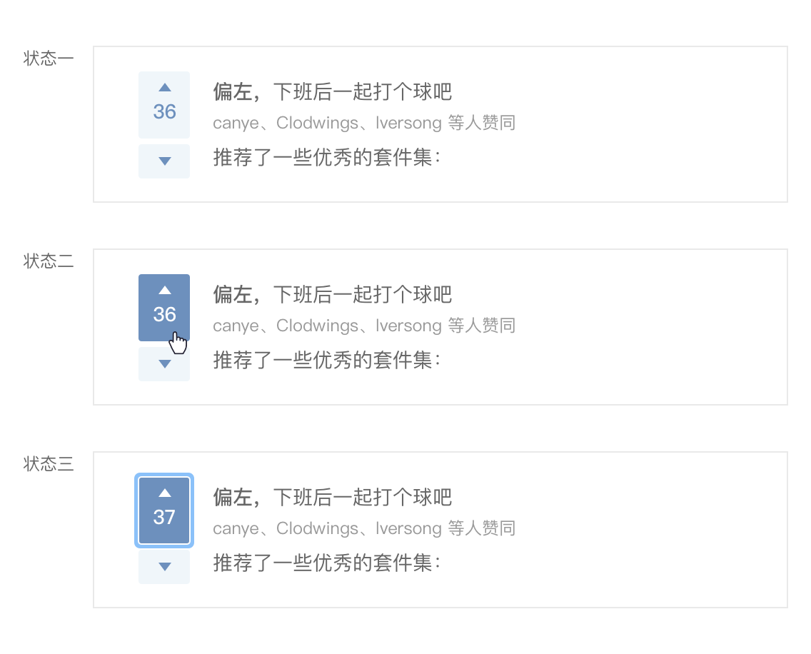
Status No.2: As hovering over the button, the mouse pointer turns into a hand symbol, and the fill colour of the button changes to a dark colour, which provides a clear call to action.
Status No.3: The style of the button obviously changes once clicked.
If an action is critical, expose it directly in the interface and keep it always visible.
Hover-Reveal Tools#
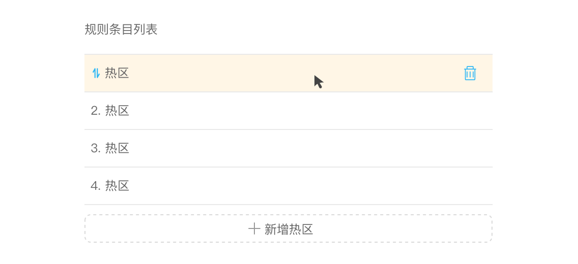
Instead of making Contextual Tools always visible, we can show them on demand. One way to do this is to reveal the tools when the user pauses the mouse over an object.
Toggle-Reveal Tools#

Toggle a tool mode for an area or page when the actions are not the main flow. The tools to accomplish this are revealed on the activation of the toggle.
Interaction in Context#


If the actions are secondary or alternative, hide Contextual Tools in the user flow, in order to keep visual clutter to a minimum, reduce the load of cognition burden and bring a surprise.
Some relative knowledge of Providing an Invitation can also be applied.
Visible Area ≠ Clickable Area#
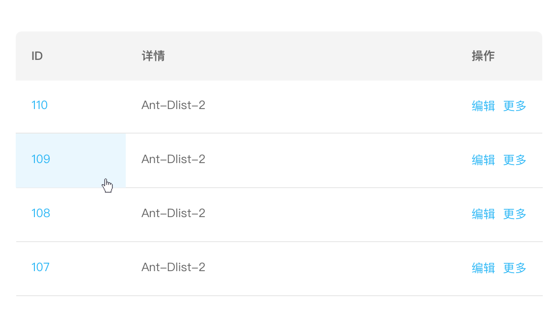
The clickable area of hypertext is affected by the length of the string in a cell. The whole cell can be set to a hot spot in order to be triggered easier.
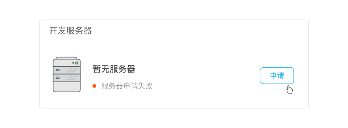
Increase the clickable hot spot to strengthen the responsiveness rather than increase the size of the button.
Note that it is especially suited for Mobile.
